Stained Glass Maps

I make stained glass maps.

I work with my clients to describe their homes. 
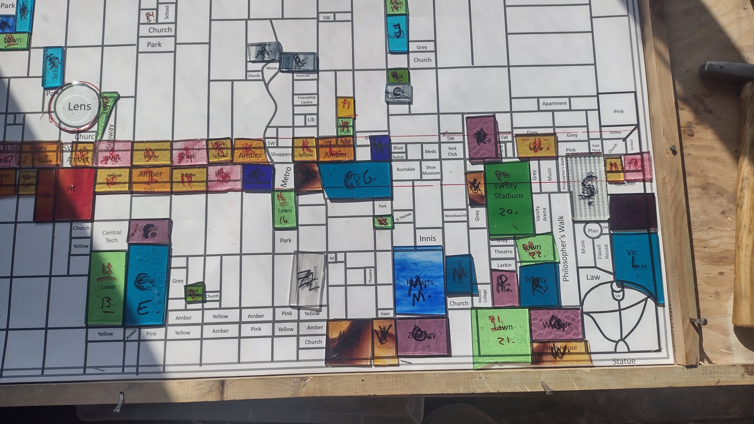
My designs use the streets as a starting point, and then add colour like a land-use map. The designs are customized to show the places my clients love: their own homes (at centre), and also coffee shops, and schools, and where they used to live.

Sometimes I match the colours to a client’s scheme, or seem a certain mood, but sometimes I use a colour code: yellow and pink for the commercial areas, blue for the institutions, green for the parks, red for transportation, and then rare colours for more specialized places. I often use purple for favourite stores.

My maps blend the Art Deco Modernism of Frank Lloyd Wright, with its emphasis on grids and rhythm, with a streak of real description. My maps are both abstract and realistic. They play musical games with light, but you can use them to find the subway.